Trade By Design Method Summary (Trade By Design) PDF Free Download
1 / 21/21
100%

Trade By Design Method Summary (Trade By Design)
This is a free indicator for members for as long as they maintain an active First Class or
higher subscription. It’s for the exclusive use of the Trade Travel Chill tribe.
Features of this indicator:
• High/Low Of the Day (H/LOD), High/Low Of the Week (H/LOW), Initial High/Low Of
the Day (IH/ILOD)
• EMA’s (10,20,50,200,800)

• Brinks Trade Spotter (Possible)
• PVSRA
• Trading Day Vertical lines

• Wick Crossing 200 EMA
• Time until next Session

Indicator Settings
When you hover your mouse over the indicator name on your chart it will expand to
show five new icons. These are:
• Show/Hide (1)
• Settings (2)
• Source Code (3) - optional
• Remove (4)
• More options (5)
When you click on the “Settings” cog you will have access to all the settings related to that
indicator. Some of these remove some aspects of the indicator others effect the way it
works. The settings we will be working with are in the “Inputs” tab. Unless expressly
specified this is where the settings will be located.
Trade By Design Method
Allowed Alerts
If you are unsure on how to enable these alerts within Trading View, detailed information
can be found by reading the description above under Market Session Times, Allowed Alerts
or by clicking here.
Possible Brink's Trades: When this option is selected and the above procedure for adding
indicator alerts have been followed this option will send an alert in the manner you selected
to inform you that a “Possible Brink's Trades” has been identified. The “Show Possible Brinks
Trade” option must be selected for this alert to be triggered.
Default: Unticked
Possible 200 EMA Trade: When this option is selected and the above procedure for
adding indicator alerts have been followed this option will send an alert in the manner you
selected to inform you that the 200 EMA line has intersected with a candle on your chart.
The “Show 200 EMA Crossings” option must be selected for this alert to be triggered. Only
1
4
5
3
2

applicable to the 1 and 4 hour time frames.
Default: Unticked
Other Alert Options
In addition to the allowed alerts, we also have a number of other alerts that can be set.
They include:
• Price crossing the 50, 200 or 800 EMA
• Price crossing the IHOD or ILOD
• Price crossing the HOD or LOD
• Price crossing the HOW or LOW
To access these alerts:
1. Select the alert icon at the top of your chart
2. Chance the condition to Trade by Design in the first box
3. In the second box you’ll find the options for the alert you want to set
Note that all alerts must be reset at the startof a new trading week as they do not rollover
week to week.
Price, Volume, Support and Resistance Analysis (PVSRA)

In order for this option to work properly you will have to disable your TradingView chart
settings for the symbols. To do this go to settings by right clicking on the chart and
selecting settings at the bottom.
Now make sure to be on the “Symbol” section. Untick “Body”, “Borders” and “Wick” and
click OK.

If you use candles for other trading strategies, another option would be to create a new
chart template and turn the candle colours off in there. That way you can have them on for
your normal charting, and have a separate template for this method.
To add new chart layouts, click on the down arrow next to your current TradingView chart
and select ‘new layout’.
You can then make the changes you need to the new chart layout and when done, click the
same arrow to name the layout whatever you like.
In future, to switch between the two layouts, select the same dropdown arrow, load layout
and load the chart you want to use.

Show PVSRA by colouring candles (For optimal performance, disable Body,
Borders & Wick In Chart Settings->Symbol): When this item is ticked it will show the
PVSRA coloured bars on your chart. PVSRA (Price, Volume, Support and Resistance
Analysis) calculates the average volume over the past 10 candles. If it increases by more
than 150% or 200% it will colour your candles. The colours can be selected below. If you
untick it the bars will revert to your original TradingView settings.
Default: Ticked
Bullish Bar colour where volume is 200% or more: This option is used to change the
colour of the 200% Bullish bar. For information on using the colour wheel see above or click
here.
Default: Guppy Green
Bullish Bar colour where volume is 150% or more: This option is used to change the
colour of the 150% Bullish bar. For information on using the colour wheel see above or click
here.
Default: Blue
Bearish Bar colour where volume is 200% or more: This option is used to change the
colour of the 200% Bearish bar. For information on using the colour wheel see above or
click here.
Default: Red
Bearish Bar colour where volume is 150% or more: This option is used to change the
colour of the 150% Bearish bar. For information on using the colour wheel see above or
click here.
Default: Fuchsia
Bullish Bar colour (Normal Candles): This option is used to change the colour of the
session background. For information on using the colour wheel see above or click here.
Default: Spanish Gray
Bearish Bar colour (Normal Candles): This option is used to change the colour of the
session background. For information on using the colour wheel see above or click here.
Default: Dark Liver (Darker Gray)

Override chart symbol? This option can be used if you want to view a chart from one
exchange but have your PVSRA candles colours be evaluated on a different exchange.
I will illustrate using this by example: You are trading day to day on OKX. OKX is a big
exchange, but Binance has more daily volume than any other exchange. You decide to get
your bearish and bullish candle colours from Binance instead. By ticking this option,
selecting your trading pair using the pencil icon, you can achieve this.
Default: Unticked, BINANCE:BTCUSDTPERP
Need more help finding these candles? This option will draw an orange triangle above
the 200% Bullish candles and an orange triangle below the 200% Bearish candles.
Once you’ve added the indicator, you might find a long list of numbers that look like this:
If that bothers you, right-click on the indicator and unselect ‘indicator arguments’. This will
remove the bulk of the information for you.

EMA’s (10,20,50,200,800)
Show 10 EMA: When this item is ticked it will show the EMA 10 line on your chart. The
EMA (Exponential Moving Average) is used to highlight price trend over a specified number
of bars, in this case 10. The EMA puts more emphasis on recent data points like the latest
prices. Hence, responds to a change in price points faster.
Default: Ticked
Set Colour: This option is used to change the colour of the EMA 10 line. For information on
using the colour wheel see above or click here.
Default: Green
Show 20 EMA: When this item is ticked it will show the EMA 20 line on your chart. The
EMA (Exponential Moving Average) is used to highlight price trend over a specified number
of bars, in this case 20. The EMA puts more emphasis on recent data points like the latest
prices. Hence, responds to a change in price points faster.
Default: Ticked

Set Colour: This option is used to change the colour of the EMA 20 line. For information on
using the colour wheel see above or click here.
Default: Orange Red
Show 50 EMA: When this item is ticked it will show the EMA 50 line on your chart. The
EMA (Exponential Moving Average) is used to highlight price trend over a specified number
of bars, in this case 50. The EMA puts more emphasis on recent data points like the latest
prices. Hence, responds to a change in price points faster.
Default: Ticked
Set Colour: This option is used to change the colour of the EMA 50 line. For information on
using the colour wheel see above or click here.
Default: Blue
Show 200 EMA: When this item is ticked it will show the EMA 200 line on your chart. The
EMA (Exponential Moving Average) is used to highlight price trend over a specified number
of bars, in this case 200. The EMA puts more emphasis on recent data points like the latest
prices. Hence, responds to a change in price points faster.
Default: Ticked
Set Colour: This option is used to change the colour of the EMA 200 line. For information
on using the colour wheel see above or click here.
Default: Yellow
Show 800 EMA: When this item is ticked it will show the EMA 800 line on your chart. The
EMA (Exponential Moving Average) is used to highlight price trend over a specified number
of bars, in this case 800. The EMA puts more emphasis on recent data points like the latest
prices. Hence, responds to a change in price points faster.
Default: Ticked
Set Colour: This option is used to change the colour of the EMA 800 line. For information
on using the colour wheel see above or click here.
Default: Dark Orchid
200 EMA Crossings

Show 200 EMA Crossing: When this item is ticked it will show the selected symbol along
with a vertical-coloured background denoting that a candle wick has intersected with the
200 EMA line. There are 2 rules that must be met for this to occur:
1. The wick must intersect the 200 EMA (not the body)
2. The wick that intersects must be larger than the body
If you untick it the crossings will not be identified.
Default: Ticked
Show Vertical background for 200 EMA Crossings: This option is used to show the
vertical background that will appear from the top of the chart to the bottom. If you untick it
the background will not be shown.
Default: Ticked
Vertical Background Line Colour: This option is used to change the colour of the vertical
background that will appear from the top of the chart to the bottom. For information on
using the colour wheel see above or click here.
Default: Green, Opacity: 25%
Symbol Colour: This option is used to change the colour of the Symbol used to denote the
200 EMA crossing on the chart. For information on using the colour wheel see above or click
here.
Default: Cornflower Blue
Symbol Style: The user has a selection of 9 symbols to choose from. Clicking on the
dropdown will show the items. Any of these can be selected. Once done this symbol will
denote the 200 EMA crossing on the chart. If you select the “None” option, then no symbol
will be show on the chart.

Symbol Size: This option will increase or decrease the size of the symbol displayed on the
chart. You have 3 options to choose from. If you find the symbol distracting, you may
choose to make it smaller.
Location of Symbol: This option is used to change the location of the symbol. It can either
be above the bar or below it. For information on location options see above or click here.
Default is: Below Bar

Brinks Trade Settings
Show Possible Brinks Trade: When this item is ticked it will show possible Brinks trades
your chart. The Brinks Trade can only occur at two possible times each trading day. This is
at 3:45 and 9:45, NY Time, (on the 15m time frame it’s the 3:30 and 9:30 candles as they
open at 3:30/9:30 and close at 3:45/9:45. At this location it will have a Hammer/Inverted
Hammer or Railway Tracks. It must be at the end of a three-level rise or fall.
Default: Ticked
Symbol Colour: This option is used to change the colour of the symbol that appears on
the chart. For information on using the colour wheel see above or click here.
Default: Light Pastel Purple
Vertical Background Line Colour: This option is used to change the colour of the vertical
background that will appear from the top of the chart to the bottom. To remove any
background colour from view you can set the opacity to 0% and it will be invisible on the
chart. For information on using the colour wheel see above or click here.
Default: Saffron, Opacity: 25%

Symbol Style: The user has a selection of 9 symbols to choose from. Clicking on the
dropdown will show the items. Any of these can be selected. Once done this symbol will
denote the Brinks Trade on the chart. If you select the “None” option, then no symbol will
be show on the chart.
Shape Location: This option is used to change the location of the symbol. It can either be
above the bar or below it. For information on location options see above or click here.
Default is: Above Bar
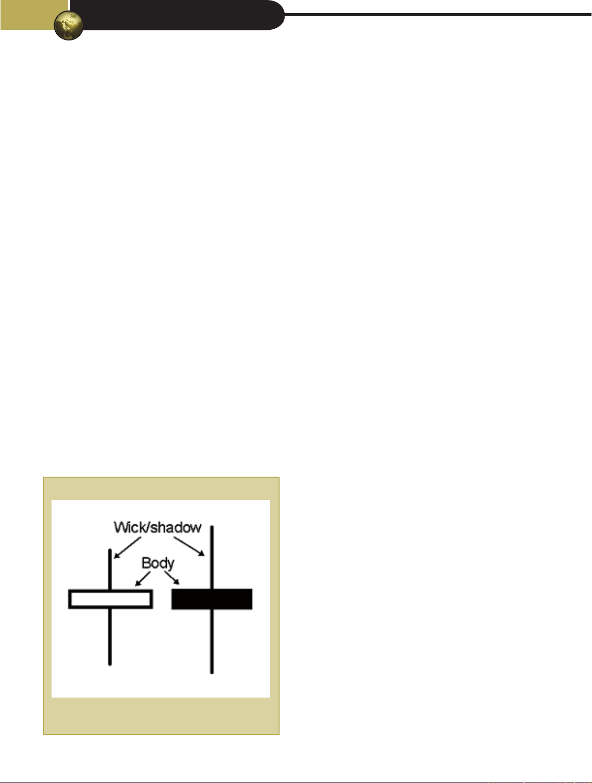
Small wick proportion of body (Recommend 0.3): The definition of a hammer/inverted
hammer is a candlestick that closes near its opening price with a long shadow to one side. A
hammer can also have a small wick/shadow on the opposite side and still be considered a
valid hammer. How big this wick is in relation to the body can be set here. Your options
range from 0 to 2 being incremented by 0.1.
Default is: 0.3
Brinks Trade Settings (Railway Tracks)
Max deviation between size of bars (Recommended 10%): Railway tracks are two
candlesticks of similar lengths; one candlestick must be bullish and the other one bearish.
You can specify the candlestick size relationship here. What this means is if you enter 10 in
this field, the other bar can be 10% bigger or smaller and the railway track will be valid.
Your options are from 1 to 50%.
Example: The first bar at 3:15 is 100 pips in size and bullish, the next bar at 3:30 is 110
pips and bearish. This is in line with our 10% deviation, and one is bearish and the other
bullish. This will be a valid Brinks signal on the Railway tracks.
Default: 10

Show Railway Track on Chart: When this item is ticked it will show Railway Tracks at
3:15 & 3:30 / 9:15 & 9:30 in addition to Hammers to denote a Brinks trade possibility. If
you untick it the Hammers will be shown if selected above.
Default: Ticked
When setting alerts for the Brinks Trade be sure to tick the box in the allowed alerts section
and then drop down to the 15 min timeframe to set your alert otherwise it will not fire.
Daily & Weekly Highs/Lows, Initial Highs/Lows
Show Daily & Weekly High/Low: When this item is ticked it will show the lines that
denote the Weekly High & Low, Daily High & Low, and Initial Daily High & Low on the chart.
The Weekly high and low is the high and low attained in the previous week. You will see the
line stretch from the beginning of last week until the current bar. The high or low will be
denoted by the symbol you select below.

The Daily high and low is the high and low attained in the previous day. If you are currently
on Monday, it will be the Sunday. The line will draw from the beginning of the day to the
end. As it was set yesterday it will never move during the day. The high or low will be
denoted by the symbol you select below.
The Initial Daily high and low is the high and low attained in the period from the Dead Zone
(17:00) to 2am(NY Time) in the Asian Session. The line will draw from the beginning of the
day to the end of the Asian Session. The line will move during the session as new highs or
lows are recorded. The high or low will be denoted by the symbol you select below.
Default: Ticked
Remove labels from High/Low Lines: When this item is ticked it will remove all the
labels and symbols from the High & Lows indicator. You will only see the lines for each of
the Weekly High & Low, Daily High & Low and Initial Daily High & Low on the chart. If you
untick it the labels and symbols will return to the chart. Once a person is familiar with their
colour selections for each line it will be of little benefit to keep the labels as it only clutters
the chart.
Default: Unticked
Show “x” number of Previous Days: If you feel that your chart is getting too busy you
may want to keep only a limited number of high and lows for the previous day. In reality
you don’t need them anymore. You are given the option of keeping one, two, three, four or
the entire weeks lines and labels (according to your settings). If you select “1 Day” you will
only see the current day and the rest will be removed. If you select “2 Days” you will see
the current day and the day before, the rest will be removed. If you select “5 Days” the
entire week will be kept, and it will be removed when the new week starts.
Default: 5 Days
Symbol Style: The user has a selection of 2 symbols to choose from. Clicking on the
dropdown will show the options. Either of these can be selected. Once done this symbol will
denote the Asian session on the chart. The Label up & Label Down option will have the text
enveloped inside the label with an arrow pointing down for a high and pointing up for a low.
When you select the “None” option the label will be removed but the text will remain.

Default: Label up (
⬆
) & Label down (
⬇
)
Line Style: This option will set the line style for your high and low lines (6 of them). Your
options are: Solid line, dotted line, line with dashed, solid line with an arrow on the left,
solid line with an arrow on the right, solid line with an arrow on both sides.
Default: Solid Line with arrows on both sides
Label Size: This option will increase or decrease the size of the font displayed on the
labels. You have 5 options to choose from. If you find the labels distracting, you may choose
to make the font smaller.
Default: Normal
Initial High of the Day Line Colour: This option is used to change the colour of the
Initial High of the Day line. For information on using the colour wheel see above or click
here.
Default: Turquoise Surf
Initial Low of the Day Line Colour: This option is used to change the colour of the Initial
Low of the Day line. For information on using the colour wheel see above or click here.
Default: Turquoise Surf
High of the Day Line Colour: This option is used to change the colour of the High of the
Day line. For information on using the colour wheel see above or click here.
Default: Orange
Low of the Day Line Colour: This option is used to change the colour of the Low of the
Day line. For information on using the colour wheel see above or click here.
Default: Orange

High of the Week Line Colour: This option is used to change the colour of the High of the
week line. For information on using the colour wheel see above or click here.
Default: Dark Orchid
Low of the Week Line Colour: This option is used to change the colour of the Low of the
week line. For information on using the colour wheel see above or click here.
Default: Dark Orchid
Label Background Colour: This option is used to change the colour of the label
background. For information on using the colour wheel see above or click here.
Default: Mantis, Ocapity:40%
Label Font Colour: This option is used to change the colour of the label font. For
information on using the colour wheel see above or click here.
Default: Orange Red
Weekly Line Width: The width of the weekly lines can be set. The weekly lines are two
lines that run vertical from the previous week to show the high and lows, respectively, for
the current week. Your options range from 1 to 4. 1 being the thinnest and 4 being the
thickest.
Default: 1
Daily Line Width: The width of the daily lines can be set. The daily lines are the line that
run vertical from the start of each day to the end of that day. It shows the high and low
from the previous day. Your options range from 1 to 4. 1 being the thinnest and 4 being the
thickest.
Default: 1
Market Session Information

Show information about next session start time: When this item is ticked it will show
the Next session table on the chart. This table will give you a visual indication of what the
current session is and when it will end. It will also tell you what the next session is and how
long before that session starts. If you untick it, the Market Session Information will not be
shown.
Default: Ticked
Header Text Colour: This option is used to change the colour of the header text. The
header is located at the top of the table in displays the word “Market Session Information”.
For information on using the colour wheel see above or click here.
Default: White
Header Background Colour: This option is used to change the colour of the header
background. The header is located at the top of the table in displays the word “Market
Session Information”. For information on using the colour wheel see above or click here.
Default: Green
Body Text Colour: This option is used to change the colour of the body text. The body text
includes all the remaining text of this table. For information on using the colour wheel see
above or click here.
Default: Blue

Body Background Color: This option is used to change the colour of the body
background. The body text includes all the remaining text of this table. For information on
using the colour wheel see above or click here.
Default: Tea Green, Opacity: 20%
Frame Colour: This option is used to change the colour of the frame. The frame is like the
border except it surrounds the table on the outside. For information on using the colour
wheel see above or click here.
Default: Green
Frame Width: The width of the frame can be set. The frame is the line that is drawn
around the table. Your options range from 1 to 4, 1 being the thinnest and 4 being the
thickest.
Default: 1
Border Colour: This option is used to change the colour of the border. The border includes
all the lines that run around the text. It excludes the lines on the outside of the table. For
information on using the colour wheel see above or click here.
Default: Tea Green, Opacity: 20%
Border Width: The width of the border can be set. The border is the lines that run vertical
and horizontal to the data inside the table. Your options range from 1 to 4, 1 being the
thinnest and 4 being the thickest.
Default: 1
Label Size: This option will increase or decrease the size of the font displayed on the
labels. You have 5 options to choose from. If you find the labels distracting, you may choose
to make the font smaller.
Default: Normal
Table Position: There are 5 possible locations to place the table on your chart. Top right is
most out of the way in my opinion. The other options are: Bottom Left/Center/Right or
Middle right. There is no Top Left as this will be in the way of all your indicators.
Default: Top Right